Pros & Cons
3 Pros:
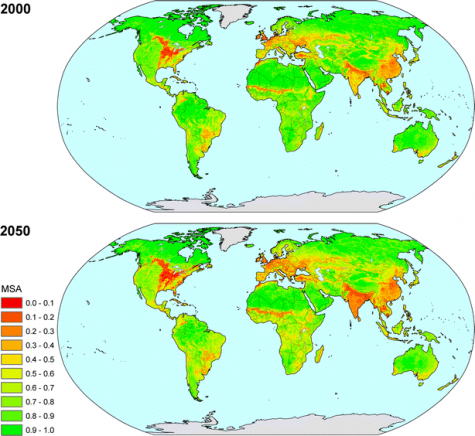
- Image: Combined relative mean species abundance of original species (MSA), using all pressure factors.
- Data are easy to perceive and intuitively understandable
- Trend from 2000 to 2050 is easy to grasp
3 Cons:
- No differentiation into classes of species
- No detailed info on scenario assumption in image
- No comparison with absolute numbers of species prevalent in the same map grid element, which would allow still better assessment of situation